


You’re investing in digital marketing.
Your ad campaigns are generating impressions and clicks.
Your SEO is working; visitors are arriving.
But somehow, the numbers that matter — leads, purchases, sign-ups — remain frustratingly low. Your site attracts attention but fails to inspire action.
This is not a traffic problem. It’s a conversion gap and most businesses misdiagnose it entirely.
While many blog posts offer surface-level advice like “use clear CTAs” or “add testimonials,” the real reasons your website isn’t converting lie deeper, at the intersection of psychology, perception, and digital decision-making. Let’s explore them.
Why Vanity Metrics Mislead
Clicks, impressions, time on site these figures give the ubiquitous appearance of progress that we all want, but almost never do they refer to intention to buy.
The majority of websites today are relevant only for reasons of attention, not because of action. Indeed, the homepage may look nice and stylish, the copy may be original, and the animations may flow smoothly, but none of this can still mean persuasion. Most digital experiences are now prioritizing aesthetics over practicality. However, the form is often at the expense of the function here.
The shocking truth is that visitors are not guided through your website by perfect confusion. They are not convinced.
Did you know? According to WordStream, the average landing page conversion rate across industries is only 2.35% — and only the top 25% of sites convert above 5%.
The Cognitive Dissonance Between Marketing and Message
One of the most common, yet ignored, causes of low conversion rates is the mismatch of the message; that is, the conflict between what your ad or search result pledges and what your landing page presents.
Have you ever seen such case that when a person clicks on a Google result that speaks about “field team efficiency”, but the target page has no clear brand points and besides, it only shows software in a very general sense, cognitive friction appears? The brain immediately detects inconsistency. Trust declines. Exit follows.
Identity is not only about branding, but it affects the neural way, as well. The broken alignment affects trust and it declines in a few milliseconds.
Why Familiar UX Can Be More Persuasive Than “Beautiful” Design
Unfamiliar design that is extremely pleasing to the eye can shock users. Various studies in human-computer interaction have shown that it is essential for users to be able to understand the tasks and actions interface is carrying out.
Where there are differences between the menu, button placement, or checkout process and the conventional in the name of creativity, that creativity can also cause an increase in cognitive load and decision anxiety but you may not have thought of it that way.
It’s in the small details that can win a UX award, not in layouts that shout for attention.
Research Insight: 88% of online users are less likely to return to a site after a bad user experience. (Amazon Web Services)
The Missing Middle: You’re Ignoring the Decision Journey
Most websites are either too eager to sell or too vague to guide. The real opportunity lies in what behavioral scientists call the “messy middle” the space between awareness and purchase, where potential customers evaluate, compare, doubt, and delay.
If your site doesn’t support this journey with layered proof, educational content, and trust-building mechanisms, users will seek answers elsewhere often on your competitor’s site.
You must ask: does your website sell the product, or does it sell the decision?
Fact: 81% of customers conduct online research before making a purchase. (GE Capital Retail Bank)
Proof Has Evolved. Has Your Site?
Testimonials and client logos are no longer enough.
Modern users look for:
- Live social proof (real-time stats, reviews)
- Transparent pros & cons
- Verified case studies
- Data-backed comparisons
Insight: Product pages with user reviews convert 270% more than those without. (Spiegel Research Center)
Being real beats being perfect. Trust is earned through transparency.
The Illusion of a “Call to Action”
Most calls to action assume visitors are ready to commit. But most aren’t. Not because they’re unqualified — but because they’re unconvinced.
“Book a Demo” may be too much, too soon.
High-performing sites offer micro-conversions:
- “Compare Plans”
- ROI calculators
- Interactive product tours
- Downloadable checklists
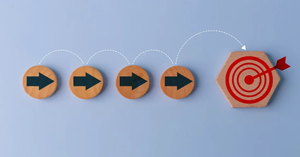
Takeaway: Conversion isn’t a button — it’s a staircase.
You’re Designing for Devices, Not for Decisions
Much effort today goes into making websites mobile-friendly. But device responsiveness is not enough.
True optimization means designing for the state of mind of the user, not just the screen they’re on. Someone scrolling on a train has different intent than someone browsing on a desktop during work hours. Context shapes commitment.
Advanced brands now tailor content sequencing, CTA type, and even visual hierarchy based on device behavior patterns not just screen size.
From Clicks to Confidence
Improving your website’s conversion rate doesn’t require more ads or fancier design. It requires a mindset shift from marketing performance to decision support.
It means asking deeper questions:
- What fears or hesitations do users have, and are we addressing them before they arise?
- Does every page give a reason to stay and a path to move forward?
- Are we guiding visitors through their journey, or expecting them to figure it out alone?
In other words: Is your website just a place people land? Or is it a place where people decide?
Final Thoughts
True success isn’t just about attracting visitors; it’s about guiding them confidently to make decisions and take action.
Instead of superficial tips, it’s essential to design a website that deeply understands user psychology and experience, delivers a consistent message, and supports the decision journey.
Remember, conversion isn’t a button—it’s guiding visitors through their path to decision. Your site should be more than just a place people visit; it should be a platform where decisions are made.


