


✦ Key Takeaways
Retailers using strong visual merchandising see sales lift up to 30% without changing a single product.
→ Poor displays cost stores thousands in missed impulse purchases daily.
→ Store layout directly controls how long shoppers stay and spend.
→ Simple shelf adjustments — like eye-level placement — drive immediate conversion lifts.
In this article:
What Makes Visual Merchandising Effective?
How to Plan a Retail Display
Visual Merchandising Tips for Shelves and Store Layouts
Seasonal and Promotional Display Tips
Key takeaway: Your store layout is your most powerful salesperson — design it with intention.
What Makes Visual Merchandising Effective?
Shoppers make up to 82% of purchase decisions inside the store — in the aisle, in real time (Contravision). Not at home. Not online.
That single fact should change how every retailer thinks about display strategy.
Most stores treat visual merchandising tips as a checklist — fix the lighting, face the products, rotate the seasonal shelf. That approach misses the point entirely.
Focal Points, Product Visibility, and Visual Hierarchy
Effective retail display strategies work because they guide the eye in a deliberate sequence. A strong focal point pulls shoppers in; visual hierarchy tells them where to look next.
Without that sequence, even a clean, well-stocked store creates friction. Shoppers stall and scan without purpose. They leave without buying — so tracking merchandising performance metrics matters just as much as the display itself.
Balancing Creativity with Sales Goals
Creative displays earn attention. But attention that doesn’t convert is just decoration.
Lightspeedhq notes that the strongest store merchandising best practices tie every visual choice directly to a revenue outcome.
Winning stores don’t just look good. They’re built as one clear visual story — and the customer follows it without noticing.
Every section advances that story, or it breaks it.
The real question isn’t whether your displays are attractive. It’s whether they’re planned well enough to work that way every single time.
How to Plan a Retail Display
That sequential visual narrative only works if you plan it before you touch a single shelf. Start with intent — not instinct.
Stores that skip deliberate planning lose customers fast. Up to 76% of purchase decisions happen in-store, which means your display plan is your sales strategy (Caad Design).
Define the display goal and target customer
Every display needs one job — drive a trial, clear old stock, or build brand awareness. Pick one goal and design every element to serve it.
Know exactly who stops at this display. A teen browsing alone needs different visual cues than a parent shopping on a tight schedule.
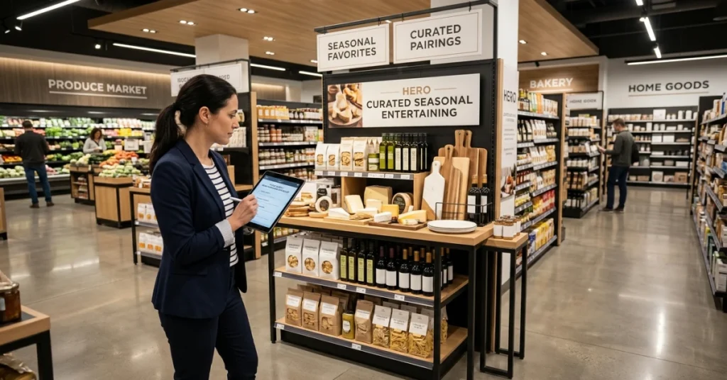
Choose hero products and supporting items
One product leads — everything else supports it. Stacking too many “heroes” creates visual noise that stalls decisions and kills conversion.
Use retail merchandising principles to group supporting items by use case, not just category. Shoppers buy solutions, not SKUs.
Test visibility, accessibility, and customer flow
Walk the display from the customer’s entry point — not from behind the counter. If the hero product isn’t visible within three seconds, the display fails.
According to Mimeo, eye-level placement drives significantly higher engagement than floor or top-shelf positioning. Accessible products get touched — and touched products get bought.
📊 By the Numbers
76% of buying decisions are made in-store — your display plan directly controls that moment.
A well-planned display sets the story. But the shelf layout and traffic flow are where that story either holds together — or quietly falls apart.

Visual Merchandising Tips for Shelves and Store Layouts
With your goal defined and your customer in mind, every shelf placement and arrangement choice now needs to do real work.
Eye Level Sells: Products placed at eye level outsell those on bottom shelves by up to 35%.
Narrative Flow: Every section should feel like the next sentence in a story the customer is already reading.
Product Blocking: Group items by color or category so the eye moves naturally across the shelf.
Cross-Merchandising: Place related products side by side to raise basket size without extra signage.
Traffic Direction: Use fixtures, lighting, and floor paths to pull customers toward high-margin zones.
Clutter Control: Dead space and overcrowded shelves both kill conversion — balance is the fix.
Place priority products at eye level
Shoppers scan shelves the way they read a page — left to right, top to bottom. Prime placement captures attention before a customer makes a conscious choice (Merit Display).
Put your highest-margin or highest-priority items right in that prime zone. Everything else earns its position based on role, not habit.
Use product blocking, spacing, and cross-merchandising
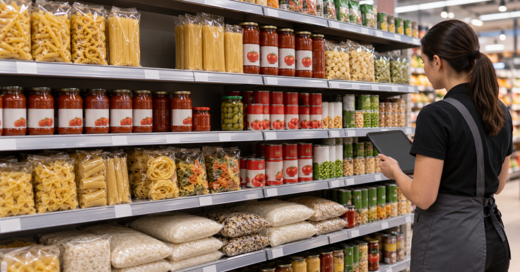
Blocking — grouping products by color or type — gives the shelf a visual rhythm that feels intentional. Shoppers move through it faster and with less friction.
Cross-merchandising pairs complementary items so the display does the selling. A pasta display with olive oil next to it is a retail merchandising strategy that lifts both SKUs at once.
Guide customers toward key categories
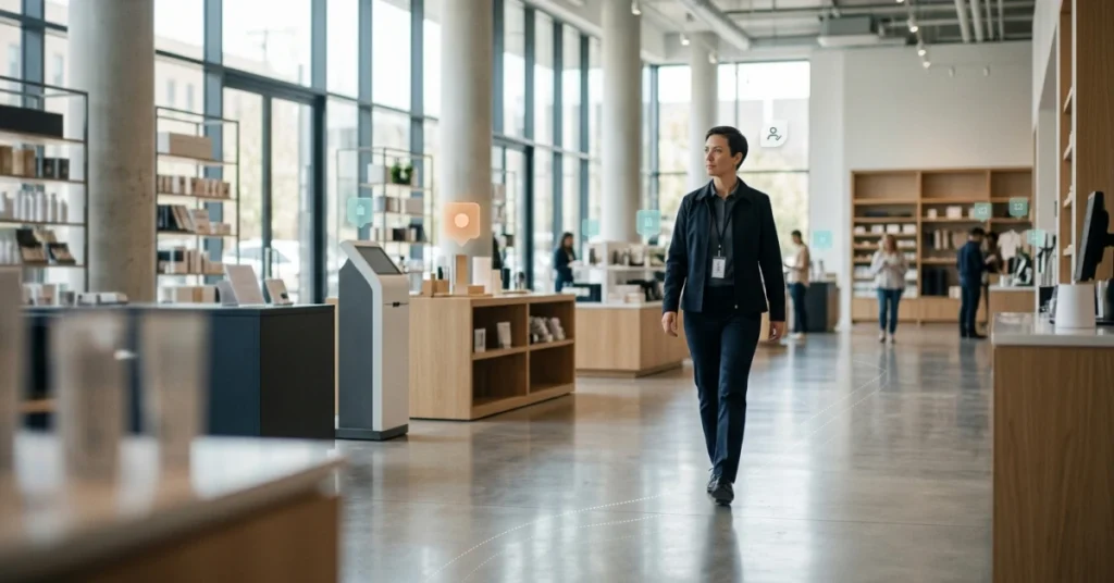
Store arrangement is behavioral architecture. Fixtures, lighting, and aisle angles all push customers in a direction — the question is whether that direction is intentional.
Stores that design traffic flow around a clear visual narrative see stronger conversion in anchor categories. Endvr reports that structured display techniques can boost in-store sales by up to 30%. That gain holds when the approach is applied consistently across the full floor plan.
Improve low-traffic areas and avoid clutter
Dead zones don’t fix themselves. Pull customers in with a strong visual anchor — a bold color block, a focal display, or a clear category sign.
Crowded shelves create mental friction and slow decisions. Merit Display finds that 82% of purchase decisions happen in-store. That makes a messy, overcrowded shelf one of the fastest ways to lose a sale.
A well-planned floor arrangement tells a clear story. The real test comes when a seasonal promotion drops into the middle of it.

Seasonal and Promotional Display Tips
Seasonal promotions are where your visual story either holds together or falls apart.
Anchor to the story: Every seasonal display should extend your store’s visual logic. Never let it interrupt the flow.
Lead with contrast: A bold seasonal color draws the eye. It does this without breaking the path customers already follow.
Group by intent: Cluster promotional products around the need they solve. Don’t just group them by the deal they offer.
Limit focal points: Too many displays compete for attention. One strong hero display beats three weak ones every time.
Use vertical space: Eye-level placement lifts sales. Seasonal displays that ignore height waste prime space.
Test and measure: Stores that track display results see up to 30% better sell-through on promoted items (Retailingcentral).
Build a visual merchandising calendar
A calendar makes you plan seasonal swaps before they happen. Don’t wait until the night before a holiday.
Map every promotion to a specific zone. That way each swap reinforces the same customer path. Strong retail merchandising strategies treat the calendar as a story script, not a to-do list.
Keep campaign displays stocked and updated
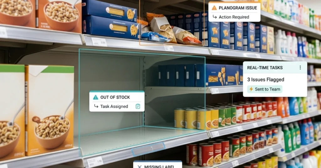
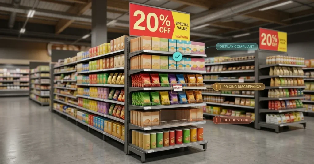
An empty promotional display is worse than no display. It signals neglect and kills purchase confidence fast.
Assign one team member to check and restock each display on a set schedule. Simple product display habits like this one separate stores that convert from stores that just look busy.
Remove expired promotional materials
Outdated signage destroys trust faster than any bad review. Customers who see last month’s sale price feel misled — even when the error was unintentional.
Displays left up past their end date break your store’s visual story. Contravision reports that 76% of purchase decisions happen in-store. Stale displays quietly drain that opportunity every single day.
Seasonal displays that feel like interruptions share one root cause. Your store never had a clear visual story to begin with.
Conclusion
One clear story, no competing noise. That principle runs through every visual merchandising tip in this article. Stores that treat each display as a chapter in a larger narrative beat those chasing seasonal trends alone.
Walk your store today as a first-time customer would. Check it not for neatness, but for narrative coherence. Does each section lead clearly to the next? Or does the visual logic break down mid-aisle?
Most retailers lose sales not because their displays look bad. The real problem is simpler. No one tracks whether the visual strategy is actually running on the floor.
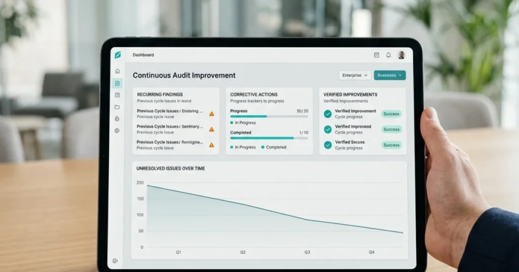
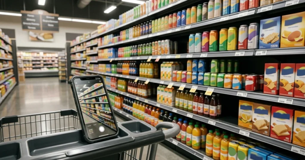
FieldPie captures real-time photo evidence and audit data at every display location. You can see exactly where your visual narrative breaks down. Then you can fix it fast.
Teams using data-driven merchandising tools close execution gaps before they cost revenue.